

It’s no wonder designers call the ceiling the “fifth wall” to note its importance when choosing a color palette for a room. After all, the ceiling is probably the largest expanse of uninterrupted space in a room, so its color greatly impacts the room’s ambience.
The right ceiling paint also makes a huge difference. For a rich, sophisticated look, choose Benjamin Moore’s Waterborne Ceiling Paint. Specifically formulated for ceilings, its ultra-flat finish absorbs more light than even the flattest wall paint, eliminating ceiling glare and hiding a multitude of common surface imperfections. With its low reflective quality, it gives you a beautiful flat look that is virtually flawless. Our Waterborne Ceiling Paint is available in thousands of gorgeous colors. Also, it’s fast-drying, goes on easily, and is spatter-resistant—leaving nothing but pure, beautiful color overhead.
The next time you’re ready to refresh the look of a room and don’t know where to begin—look up! Adding color to your ceiling requires no more time or effort than painting it white, yet this simple act can completely transform the look and feel of a room.
Here are a few ceiling color tips to help you create a more beautiful room:
A New Altitude
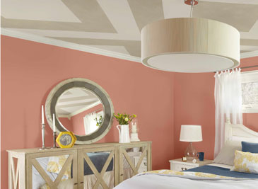
 A large room with a high ceiling can feel impersonal or unbalanced when furnishings, floor coverings, and accessories visually occupy the bottom half of the space, leaving the top portion looking bare and boring.
In a room like this, experiment with a ceiling color in a deeper shade or apply a pattern. In this example, we used color to create an architectural feature. To create this faux cove ceiling, we used midsummer night (2134-20), a rich cocoa color, surrounded by creamy frappe (AF-85) to produce the recessed look.
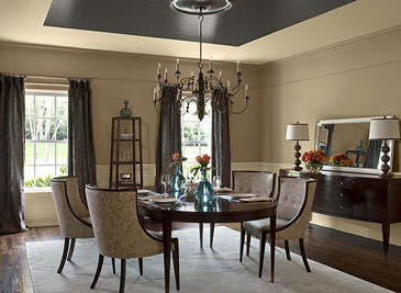
A decorative ceiling medallion and chandelier create an interesting focal point in the center of the ceiling and contribute to the formal yet warm feel of the room.
Make Your “Accent Wall” the Ceiling
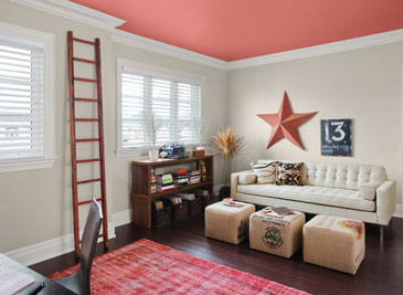 Neutrals are the perfect transitional colors. Carried from room to room, they create harmonious color flow throughout the home. In rooms with neutral-colored walls, an unexpected pop of color on the ceiling adds interest and personality, and can really turn up the charm.
In this home office, the creative use of color on the ceiling brings the eye up and creates a vibrant focal point. Cheerful persimmon (2088-40) envelopes this otherwise neutral space with rich, warm color without overwhelming it. It beautifully complements the light walls.
For ceiling color ideas, look to the furnishings and other room elements for inspiration and choose a color that complements them.
Above and Beyond
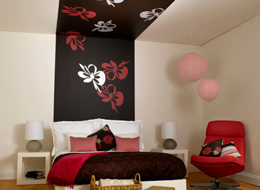 Higher ceilings cry out for creative treatments. They can handle bold colors and designs, even in smaller rooms.
In this room, neutral walls, a high ceiling, and spare furnishings present a blank canvas for a dramatic design element.
The stenciled designs painted in cherry wine (2080-30) and frostine (AF-5) dance on a background of chocolaty brown sugar (2112-20).
We picked up the accent colors seen in the bedding, pillows, and chair to create a strong graphic that maximizes the vertical space and balances the other elements in the room. The wide stripe extends the headboard up the wall and onto the ceiling, drawing the eye upward.