

It’s no wonder designers call the ceiling the “fifth wall” to note its importance when choosing a color palette for a room. After all, the ceiling is probably the largest expanse of uninterrupted space in a room, so its color greatly impacts the room’s ambience.
The right ceiling paint also makes a huge difference. For a rich, sophisticated look, choose Benjamin Moore’s Waterborne Ceiling Paint. Specifically formulated for ceilings, its ultra-flat finish absorbs more light than even the flattest wall paint, eliminating ceiling glare and hiding a multitude of common surface imperfections. With its low reflective quality, it gives you a beautiful flat look that is virtually flawless. Our Waterborne Ceiling Paint is available in thousands of gorgeous colors. Also, it’s fast-drying, goes on easily, and is spatter-resistant—leaving nothing but pure, beautiful color overhead.
The next time you’re ready to refresh the look of a room and don’t know where to begin—look up! Adding color to your ceiling requires no more time or effort than painting it white, yet this simple act can completely transform the look and feel of a room.
Here are a few ceiling color tips to help you create a more beautiful room:
Taking Style to New Heights
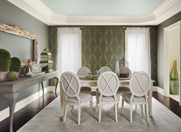 In this dining room, long, slim windows and generously proportioned crown molding work to lower the tray ceiling. Too much color or a busy pattern on the ceiling would make the room feel closed-in.
By contrast, soothing wythe blue (HC-143) on the ceiling creates the light, airy feeling of a springtime sky and seems to lift the entire room. Subtle and sophisticated, it complements the traditional dark wall color and softens the room’s overall formality.
This calming blue pairs well with the light-colored furnishings, floor covering, and curtains.
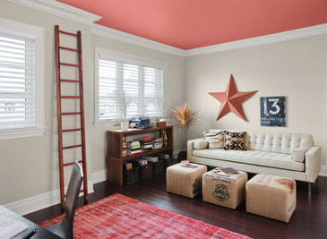
Get this elegant look by painting the walls sharkskin (2139-30) and the trim battenberg (AF-70). The stencil design was done in fresh olive (2149-30).
Things Are Looking Up
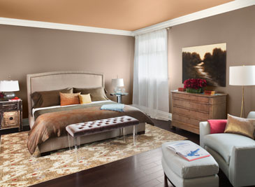 Warm, organic colors on both the walls and ceiling create a cozy yet elegant look in this modern bedroom.
The walls are painted in stardust (2108-40), a deep, warm, sophisticated taupe. Pairing this color with tone-on-tone furnishings and accessories in soft, muted hues creates an almost monochromatic color scheme.
To provide a pop of contrast and a visual “break,” we’ve painted the ceiling in warm farm fresh (AF-360). Its subtle orange tone adds an overall glow to the room. This hue complements a wide range of other colors, making it a perfect choice to repeat throughout your home.
When working with a tone-on-tone color palette, use texture and patterns in your décor to create visual interest.
Over-the-Top Glamour
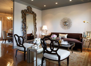 This modern home features an unconventional mix of contemporary and traditional furnishings. Along with the large-scale design pieces, there’s a lot to look at in this eclectic decorating scheme.
This room provides the perfect example of how to add a bit of drama while maintaining a neutral color scheme.
The walls are painted in sand lot gray (2107-50), a warm neutral with a rosy undertone, to provide a non-competing backdrop for the room’s furniture and design elements.
A darker tone of gray on the high ceiling brings the eye down, allowing the room’s architectural details and other elements to take center stage. We chose rich, classic chelsea gray (HC-168) to give this ceiling a touch of glamour.